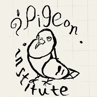
Through my recent outings, I had gathered an iPad case whose logo was the inspiration for the dualistic and opposing curves of the P and g letters used in this new rendering of a logo.
Although the rest of the font is not optimally stylized, I feel like this take on a square image icon is reasonably a step up from just a pigeon, in and of itself; a sole figure whereas screen space is increasing in density, and more detail can be brought in to a smaller space.
 |
| I feel like it has a bit of the Fibonacci sequence in the Rotarian-ness of it, I’ll work at it some more, |


